Budget Munchies
Welcome to the Budget Munchies home page!
TABLE OF CONTENTS
- Overview
- User Guide
- Developer Guide
- Administrator Guide
- Community Feedback
- Current State of the Project
- Project Pages
- Deployment
- Team
Overview
This project offers a solution for college students on the hunt for recipes that are cheap, easy to make, and have limited ingredients. Users will be able to share recipes that have information such as cost per meal, appliances needed, dietary restrictions, time it takes to make, etc.
Students will be able to search, browse, and post recipes to the site. The recipes should at least include full ingredients list, appliance used, a picture of the finished meal, and the directions itself. There will be a favorite recipes page and the landing page will have some of the weekly favorites from the users.
User Guide
Landing Page (Signed Out)
Upon visiting the Budget Munchies site, you will arrive on the initial landing page, without user sign in.

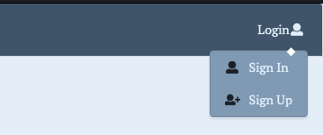
Login Options Page
This is what you will see when you click on the login option at the top right.
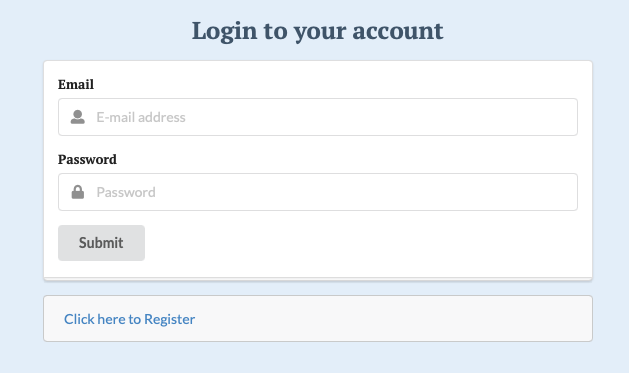
Sign-in Page
This is the sign in page. If you don’t have an account with Budget Munchies, you can create one!
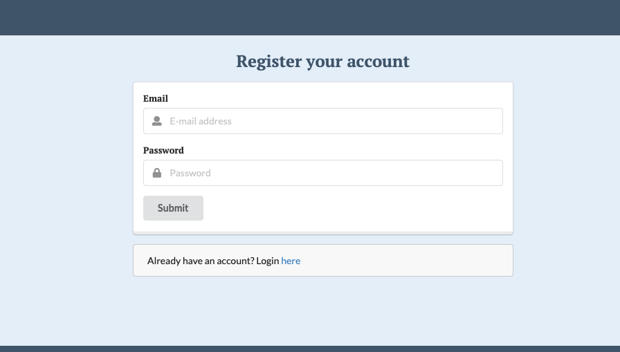
Sign-up Page
Landing (Signed In)
This is the landing page after user sign-in. Signing in enables you to see additional pages and elements.

Browse Recipes dropdown Menu
You can click on the browse recipes button that will present you with a dropdown menu. You can select the type of meal recipes you would like to browse.

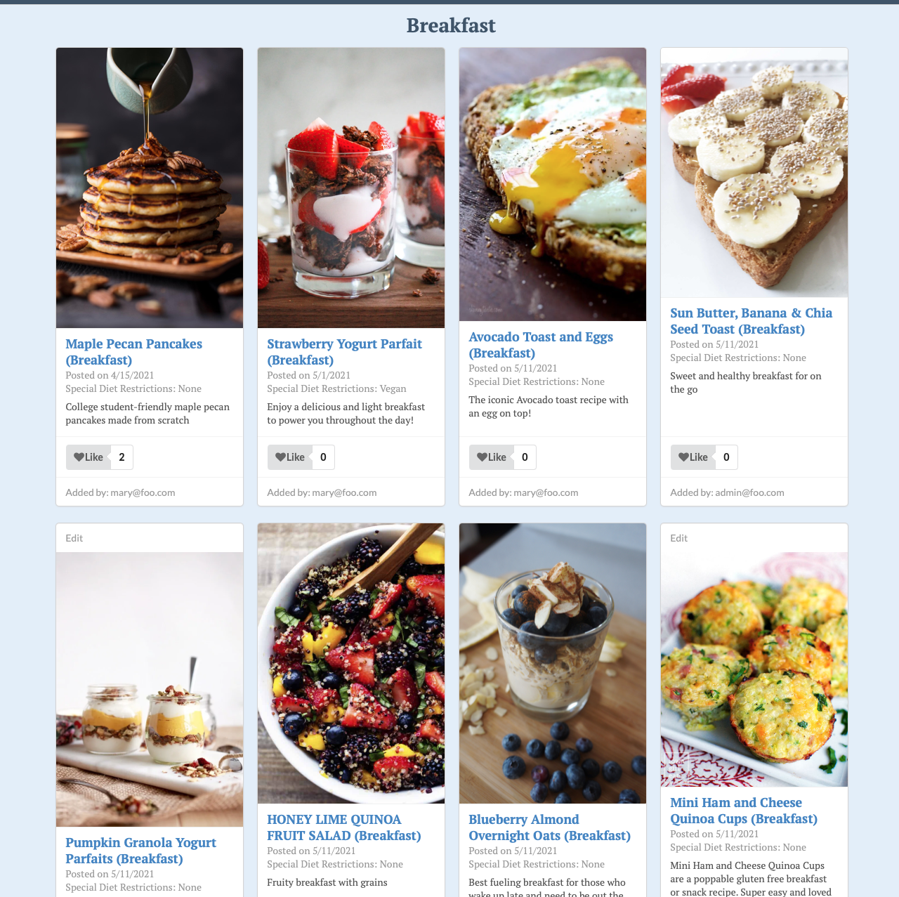
Breakfast Page
This is the breakfast page that shows all of the breakfast recipes on the site.
Lunch Page
This is the lunch page that shows all of the lunch recipes on the site.

Dinner Page
This is the dinner page that shows all of the dinner recipes on the site.

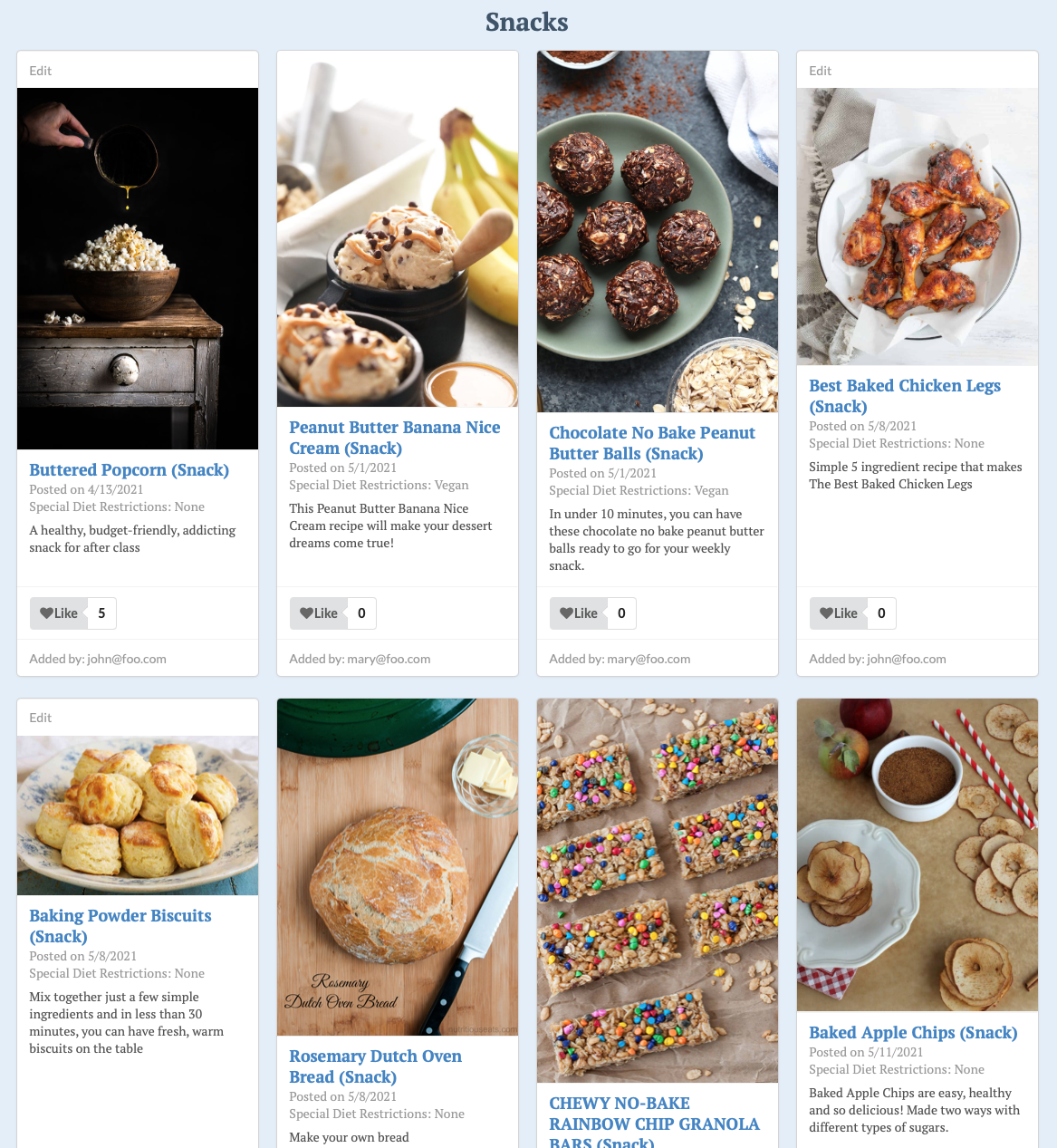
Snack Page
This is the snack page that shows all of the snack recipes on the site.
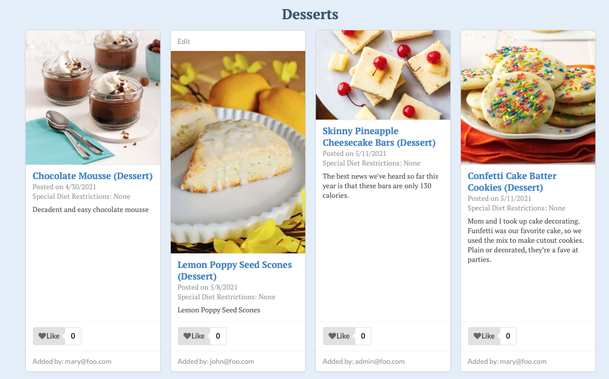
Dessert Page
This is the desserts page that shows all of the breakfast recipes on the site.
Add Recipes Page
This page allows you to add recipes to the site under your username.

My Recipes Page
This page will show a list of recipes. It currently shows a stock table database.

Edit Recipes Page
After navigating to your “My Recipes” page, you can select an option to edit a recipe you have published.

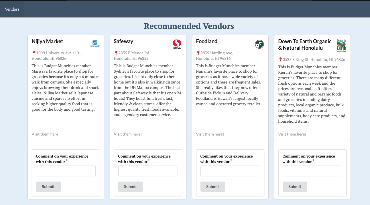
Vendors
This page contains information about a few of staff’s favorite vendors!
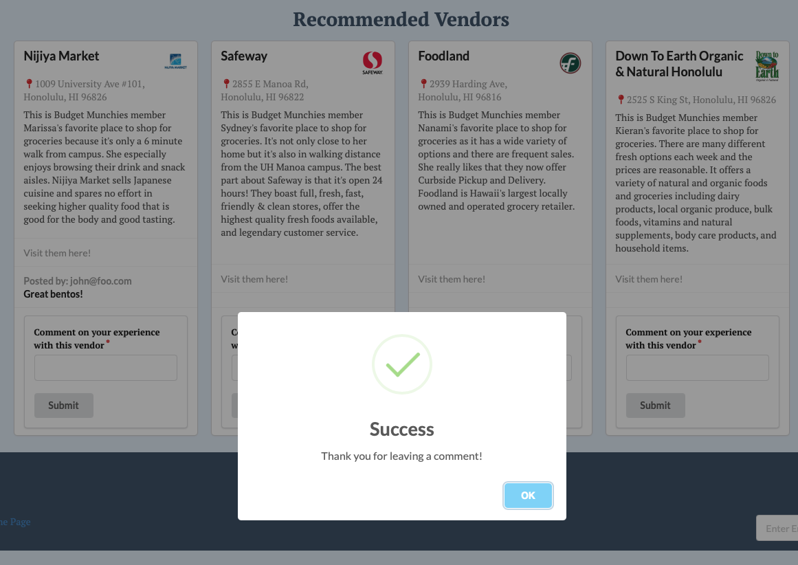
Comments
Users can leave comments about the vendors directly on the vendors page.
User Profile
After signing in, the user can click the top right drop down where their username is, and access some options.
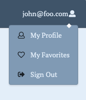
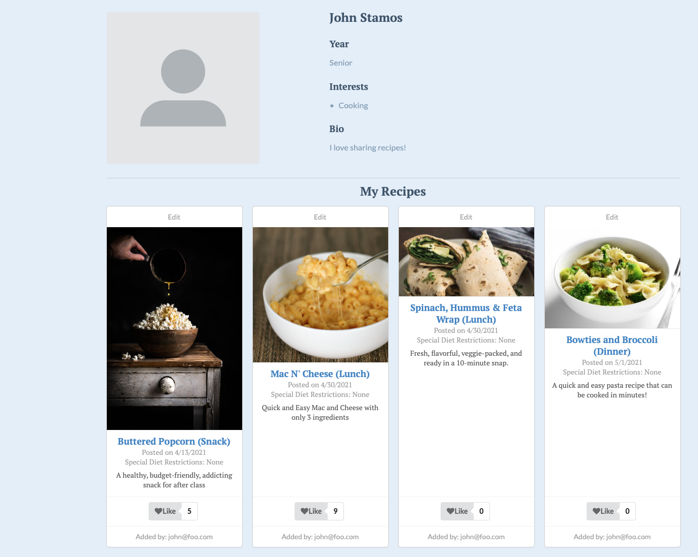
My Profile
Clicking “My Profile” Will take you to your dedicated user profile.
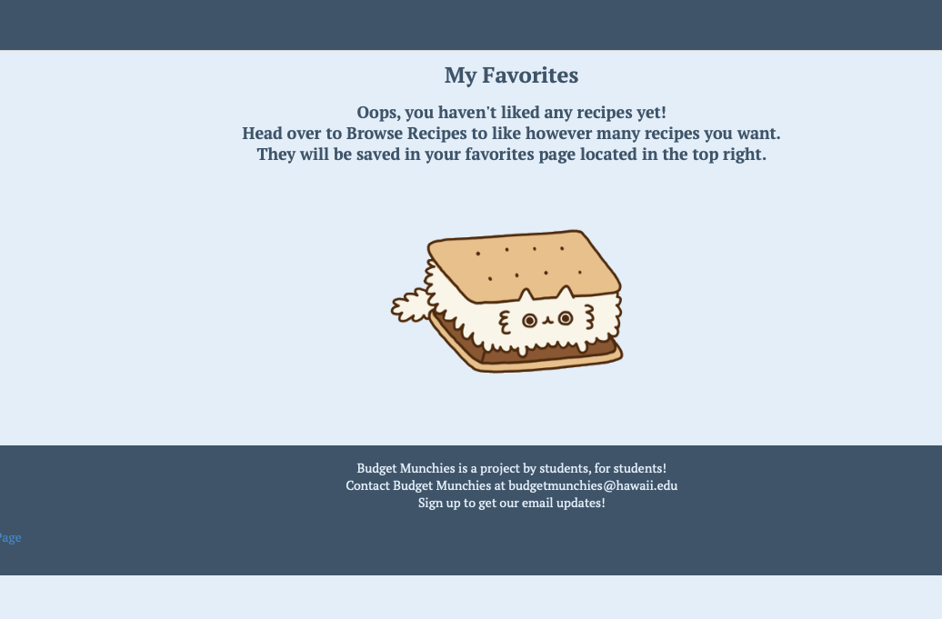
My Favorites
Clicking “My Favorites” will take you to a page that shows all of your favorited recipes! If you haven’t favorited anything it will display this message:
Sign-out
After you’re finished visiting the website, you can sign out! This is the page that will be displayed to you.

Developer Guide
This guide is an explanation of how to download, install, and run the system via github, meteor, and terminal/command line.
Installation
First, install Meteor.
Second, download Budget Munchies Repository to your computer using the green code button. You can download it as a zip file, or you can click open with GitHub desktop.
Third, cd into the app/ directory of your local copy of the repo, and install third party libraries with:
$ meteor npm install
Running the system
Once the libraries are installed, you can run the application by invoking the “start” script in the package.json file:
meteor npm run start

> meteor-example-form-react@ start /Users/philipjohnson/github/ics-software-engineering/meteor-example-form-react/app
> meteor --no-release-check --settings ../config/settings.development.json

[[[[[ ~/github/ics-software-engineering/meteor-example-form-react/app ]]]]]

=> Started proxy.
=> Started MongoDB.
W20190718-11:08:30.749(-10)? (STDERR) Note: you are using a pure-JavaScript implementation of bcrypt.
W20190718-11:08:30.770(-10)? (STDERR) While this implementation will work correctly, it is known to be
W20190718-11:08:30.771(-10)? (STDERR) approximately three times slower than the native implementation.
W20190718-11:08:30.771(-10)? (STDERR) In order to use the native implementation instead, run
W20190718-11:08:30.771(-10)? (STDERR)
W20190718-11:08:30.771(-10)? (STDERR)   meteor npm install --save bcrypt
W20190718-11:08:30.771(-10)? (STDERR)
W20190718-11:08:30.771(-10)? (STDERR) in the root directory of your application.
=> Started your app.

=> App running at: http://localhost:3000/
Note regarding “bcrypt warning”:
You will get the following message when you run this application:
Note: you are using a pure-JavaScript implementation of bcrypt.
While this implementation will work correctly, it is known to be
approximately three times slower than the native implementation.
In order to use the native implementation instead, run

  meteor npm install --save bcrypt

in the root directory of your application.
On some operating systems (particularly Windows), installing bcrypt is much more difficult than implied by the above message. Bcrypt is only used in Meteor for password checking, so the performance implications are negligible until your site has very high traffic. You can safely ignore this warning without any problems during initial stages of development.
Viewing the running app
If all goes well, the application will appear at http://localhost:3000.
ESLint
You can verify that the code obeys our coding standards by running ESLint over the code in the imports/ directory with:
meteor npm run lint
Testing with TestCafe
This application has continuous integration and testing with TestCafe. Tests should run automatically, otherwise you need to Control C out of the terminal/command window, and invoke “meteor npm run testcafe” inside the app directory. This will run the created tests.
Prerequisites
To best understand this application, it is useful to familiarize yourself with:
-
Meteor Application Template React. This sample application illustrates conventions for directory layout, naming conventions, routing, integration of Semantic UI, and coding standards. Meteor-example-form is based on this template, so we won’t discuss any of these issues here.
-
Semantic UI React. We use Semantic UI for this template.
-
Uniforms. Uniforms is a library for simplifying form management with React, and includes built-in integration with Semantic UI.
Administrator Guide
Landing Page (Administrator Signed-in)
Upon logging in as administrator, the landing page will look like this. You will notice an additional “admin features” option on the navigational bar.
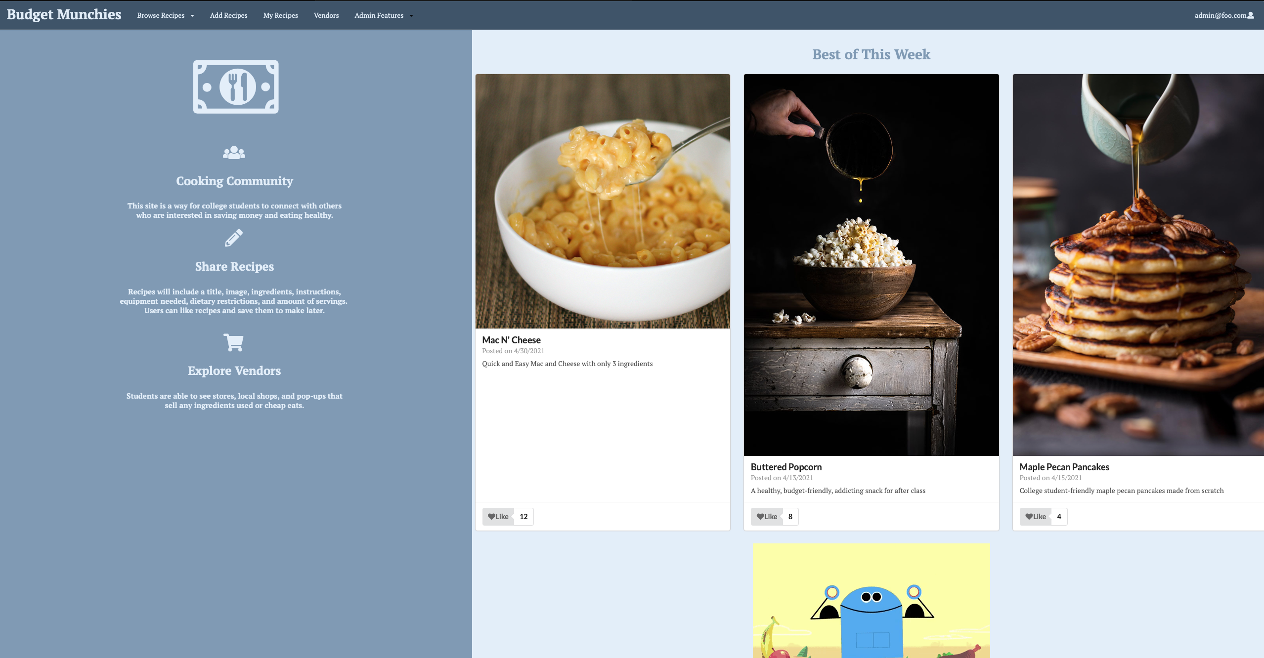
Admin Features
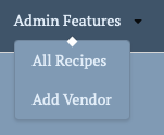
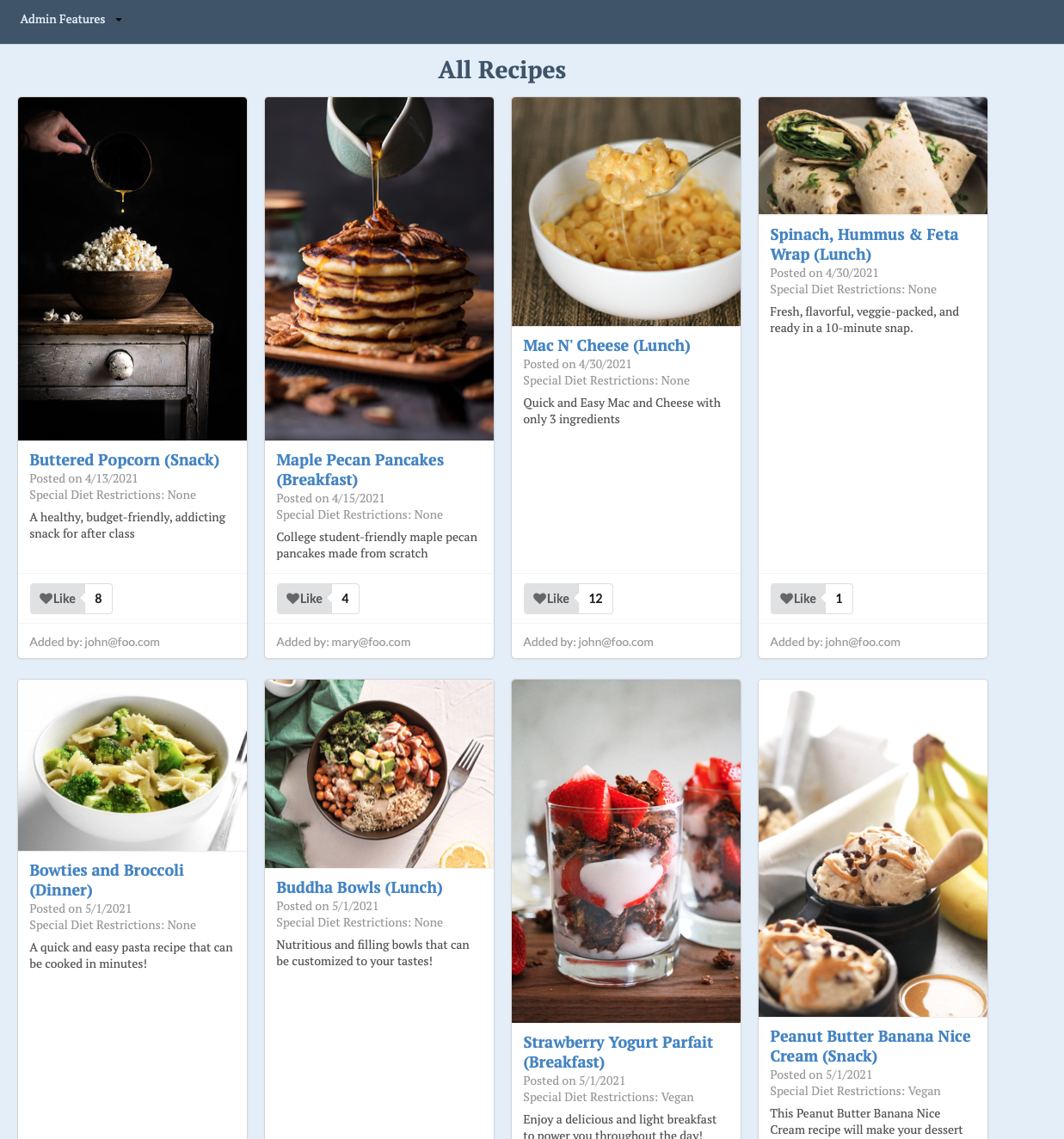
The dropdown menu for admin features shows two options, add a vendor and list all recipes.
Adding a Vendor

Listing All Recipes
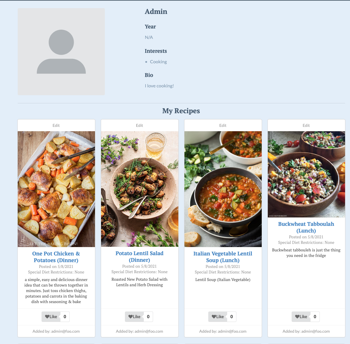
Admin Page
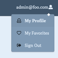
Additionally, you can access the admin profile page and favorites page the same as users can.

Original Design Mockups
These were our original mockups while we were in the planning phase of our application.
Mockup landing page
This is the original team favorite design of our landing page. Our team all created test landing page mockups and we went with this one for the design and color scheme.

Alternative landing page
This is an alternative of the lading page. It looks similar to the original landing page with some tweaks. This was created after deciding the colors and design we wanted to follow.
Mockup user home page
This is the mockup design for the user home page. When the user signs in, or signs up, this is the page they will be directed to after.
Mockup add recipe page
This is a mockup of a page where users can add recipes.
Deployment
Budget Munchies deployed on Digital Ocean
Testing and Continuous Integration
Current testcafe results
Current state of the project
Please view the User Guide for the current state of the project.
Project Pages
M1
M2
M3
Github Organization
Community Feedback
Our team had six individuals test our project in order to give us valuable feedback on how we can improve everything from the functionality to the color scheme. If you would like to give feedback on our application, please contact one of the Budget Munchies developers at the bottom of this page.
Reviewer 1: “The purpose of the website is clear and makes sense. The color scheme is very calm and inviting, but I would have added something slightly color blocking. The colors are nice but they run together and make the site look a little bland in my opinion. The site also resembles something from the 90’s. I think making it a look mroe modern would be cooler. I like the idea though!”
Reviewer 2: “I like the design a lot. I think it looks like a restaurant. Wouldn’t this be better as a phone app? If you made this into a phone app it would be more applicable to college students I think. If I wa smaking this, I would have a section where people could leave reviews or notes on the recipes. Kind of like when you go to a recipe site, people will write in the comments “this recipe sucked” or “this didn’t work out for me”. That way, people can explain if the got a problem, someone can say how they fixed it or different ingredient changes. Oh I think having a converter would be good, so you can adjust recipe to show ingredient quantity to make for different serving amounts.”
Reviewer 3: “I recommend changing the font. The website looks really old. I think having some sort of interactive features or something to make it look up to date would make it more appealing. The text would look better if it was white instead of the muted color you have now. It would stand out and grab attention more.”
Reviewer 4: “The website looks very nice and it is easy to use. Signup process is simple and enjoyed the layout of the recipes. If I could recommend one thing it would be the ability to filter to show only vegan recipes, that would save me time if I were using the site since I am vegan.”
Reviewer 5: “I like all the functions of the website and I think it would be cool to include a search bar or filter system when the number of recipes increase. I think Add Recipe and My Recipes could have been under the dropdown menu of the use instead in the navbar since those functions are them. Some issues I see with the designs are that the last recipe in the home page is cut off. I also think it would’ve been better to divide the page horizontally instead of vertically because that is how our eyes naturally move when reading.”
Reviewer 6: “The overall functions for the website is good. I wish the website used red or white in the color scheme instead of the muted blues. A lot of food companies use the color red because it is the color of enticement so incorporating it would have been great. The form to add the recipe is long and should be more condensed in order to not overwhelm the user. I wish I could upload my own image instead of having to use a url. Also, for images displayed when you click on a recipe, I think it should be more even.”
